
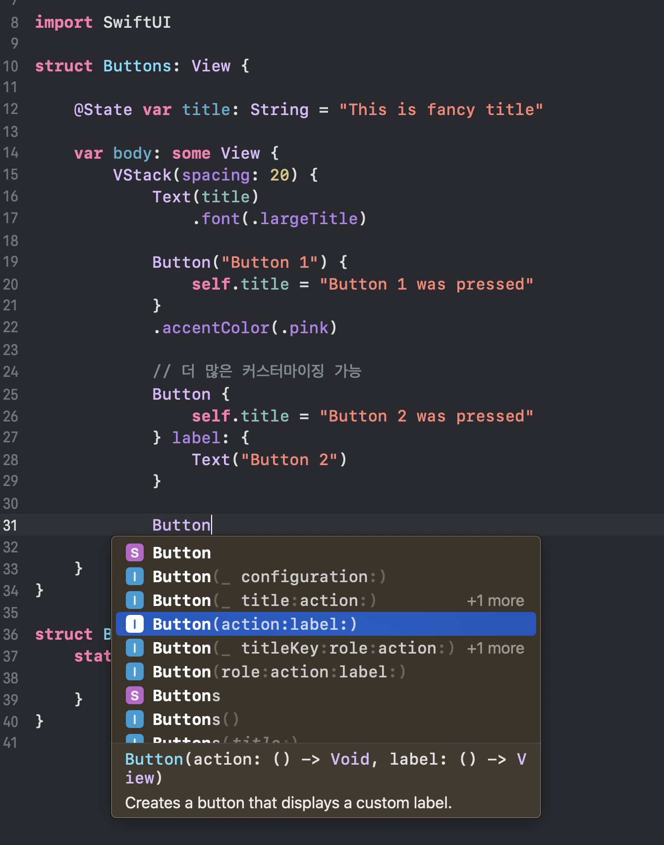
Button(_ title:action:) -> String title로 간편하게 만들 수 있음
Button(action:label:) -> label에는 어떤 view든 올 수 있음 (커스터마이징 자유롭게 가능)
action에는 버튼이 눌렸을 때 작동할 원하는 동작을 클로저로 전달하면 되고
label에는 원하는 뷰로 버튼의 모습을 커스터마이징 할 수 있다.
// Created by Toughie on 2023/04/20.
//
import SwiftUI
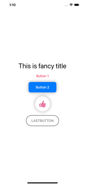
struct Buttons: View {
@State var title: String = "This is fancy title"
var body: some View {
VStack(spacing: 20) {
Text(title)
.font(.largeTitle)
//MARK: - BUTTON1
Button("Button 1") {
self.title = "Button 1 was pressed"
}
.accentColor(.pink)
//MARK: - BUTTON2
Button {
self.title = "Button 2 was pressed"
} label: {
Text("Button 2")
.font(.headline)
.fontWeight(.semibold)
.foregroundColor(.white)
.padding()
.padding(.horizontal, 20)
.background(
Color.blue
.cornerRadius(10)
.shadow(radius: 10)
)
}
//MARK: - BUTTON3
Button {
self.title = "Like Button was pressed"
} label: {
Circle()
.fill(Color.white)
.frame(width: 75, height: 75)
.shadow(radius: 10)
.overlay(
Image(systemName: "hand.thumbsup.fill")
.font(.largeTitle)
.foregroundColor(Color(#colorLiteral(red: 0.9098039269, green: 0.4784313738, blue: 0.6431372762, alpha: 1)))
)
}
//MARK: - BUTTON4
Button {
self.title = "Last Button was pressed"
} label: {
Text("LastButton".uppercased())
.font(.body)
.bold()
.foregroundColor(.gray)
.padding()
.padding(.horizontal, 10)
.background(
Capsule()
.stroke(Color.gray, lineWidth: 3)
)
}
}
}
}
struct Buttons_Previews: PreviewProvider {
static var previews: some View {
Buttons()
}
}'SwiftUI > SwiftUI(Basic)' 카테고리의 다른 글
| 18. [SwiftUI] Extract Functions & Views (코드 정리) (0) | 2023.04.21 |
|---|---|
| 17. [SwiftUI] @State (0) | 2023.04.21 |
| 15. [SwiftUI] .ignoresSafeArea() & .edgesIgnoringSafeArea() (0) | 2023.04.20 |
| 14. [SwiftUI] LazyVGrid, LazyHGrid, GridItems (0) | 2023.04.19 |
| [SwiftUI] PropertyWrapper, @State, @Binding (0) | 2023.04.13 |


